Overview
Almost 500,000 out of 6 million companies in Brazil are small or medium-sized (also known as SME companies). The power of SMEs is evident in their 30% share in Brazil's R$ 4,4 trillion GDP. The segment employs more people than any other: 10,1 million people are employed in small companies and 5.5 million in medium-sized companies.
For this reason, Serasa Experian, the largest Latin American database, created the SME business unit to serve B2B’s client up to R$ 70 millions budget.
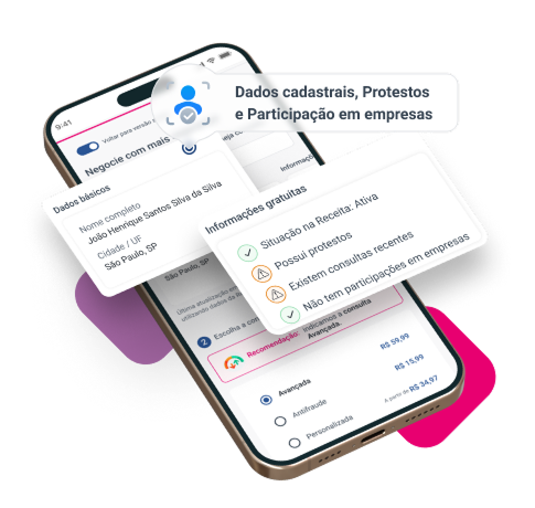
What does it mean? Creating solutions that help these SME’s to trade safely, finding customers of the desired profile, recovering debts faster and monitoring your company.
The problem
Serasa Experian SME's area underwent a restructuring in 2019. As a result, some products previously offered only for small enterprises have been incorporated and should now be offered to SME customers as well.
Challenge
Create an unique shopping experience for customers at different maturity levels.
My role
I was responsible for:
• User Research
• Prototyping
• User Testing
• UI Design (Responsive web)
• Data Analysis
Squad: Product Owner, Content Writer, Marketing Specialists, Back/Front Developers.

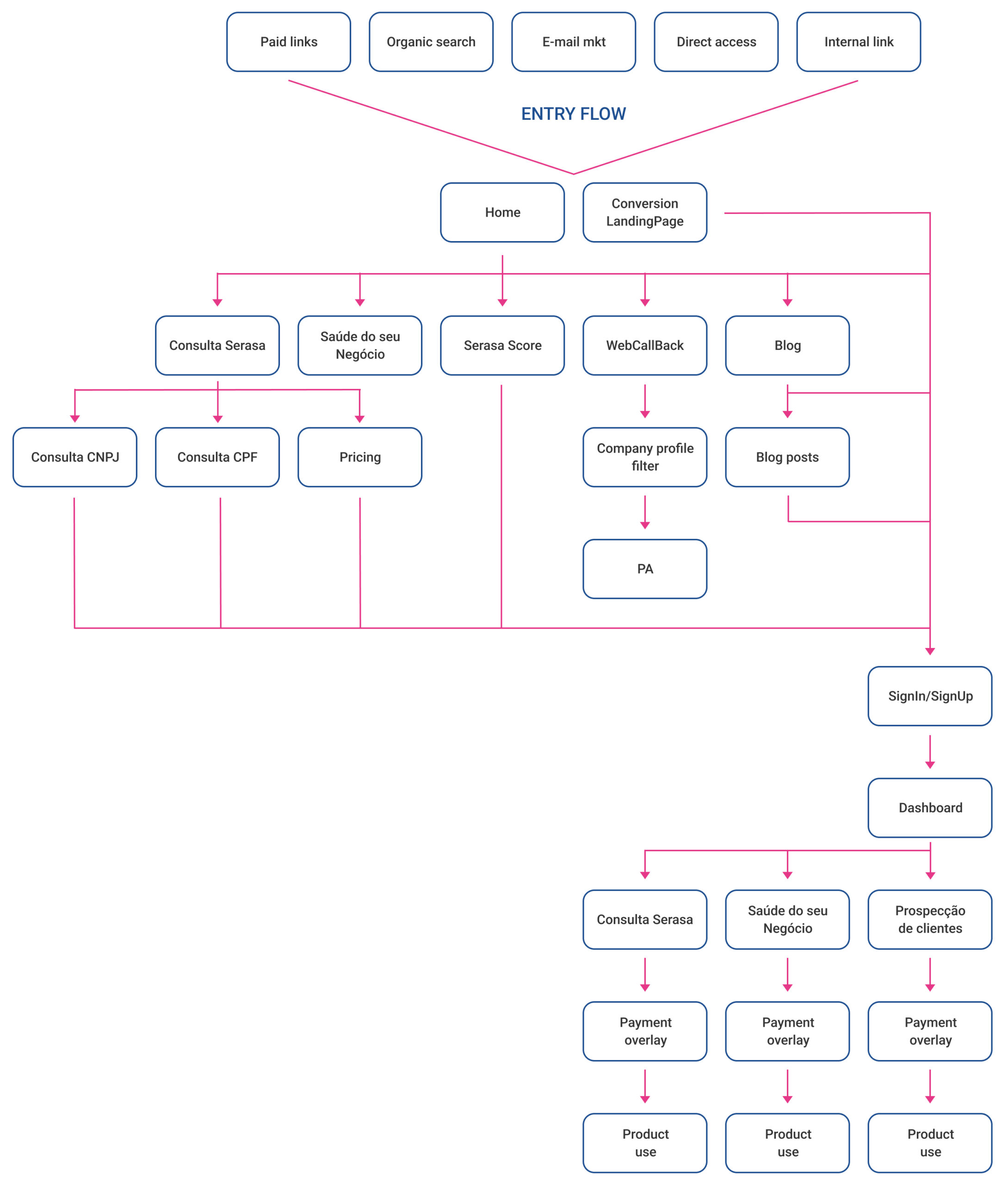
Acquisition flow
The key point of the user's acquisition flow is to make it clear that he can navigate to different paths, ensuring that the story told at each stage of your journey will be highly explanatory. Then, we will be able to convert it in a true way, where the user will know what he is buying and will not feel frustrated.

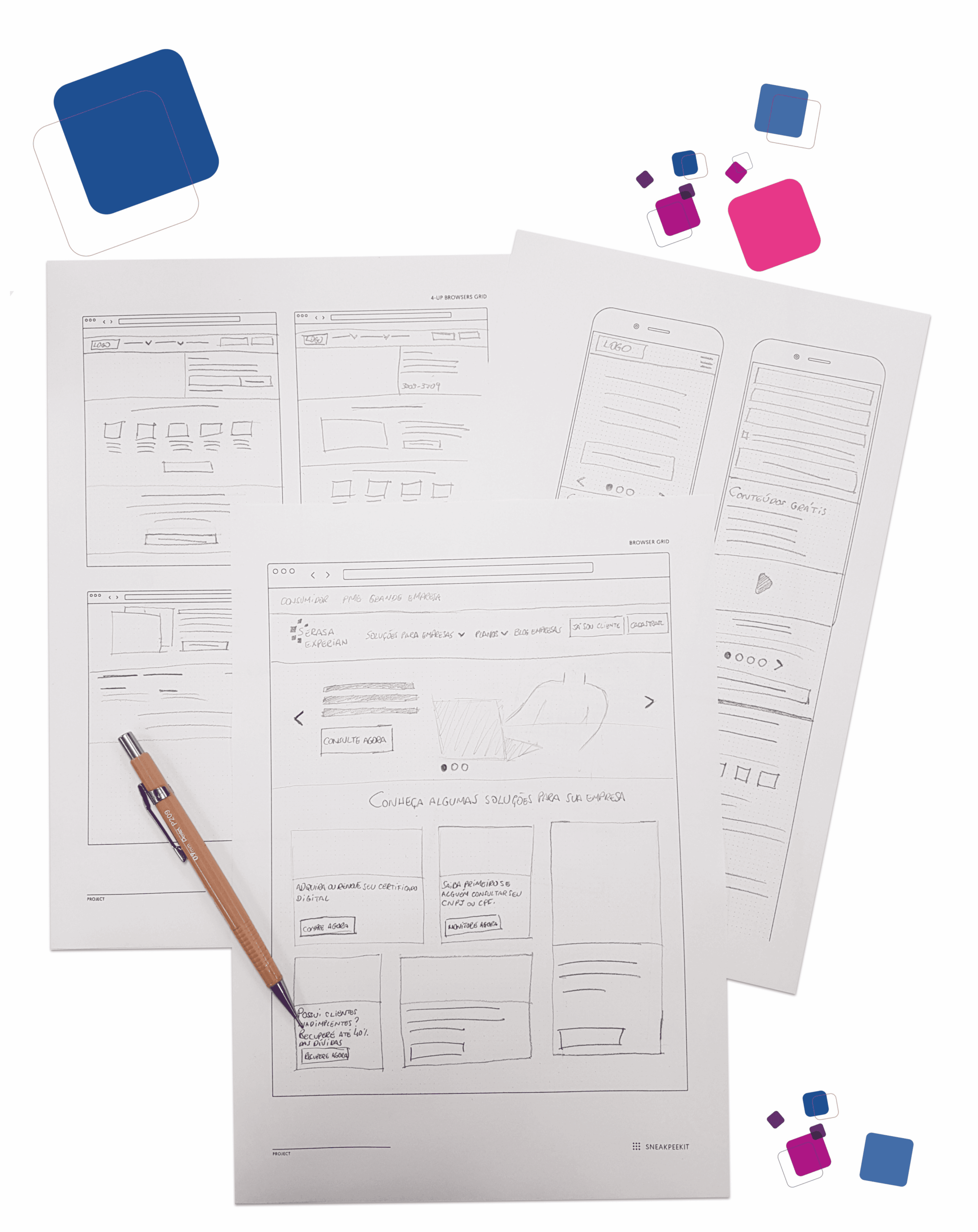
Prototyping ideas
The prototyping stage started with low fidelity drafts, structuring ideas collected during the discovery stage. After team validation, we continue with high-fidelity prototyping for stakeholders and users validation, seeking to guarantee the best experience within the flow created.

Building the UI
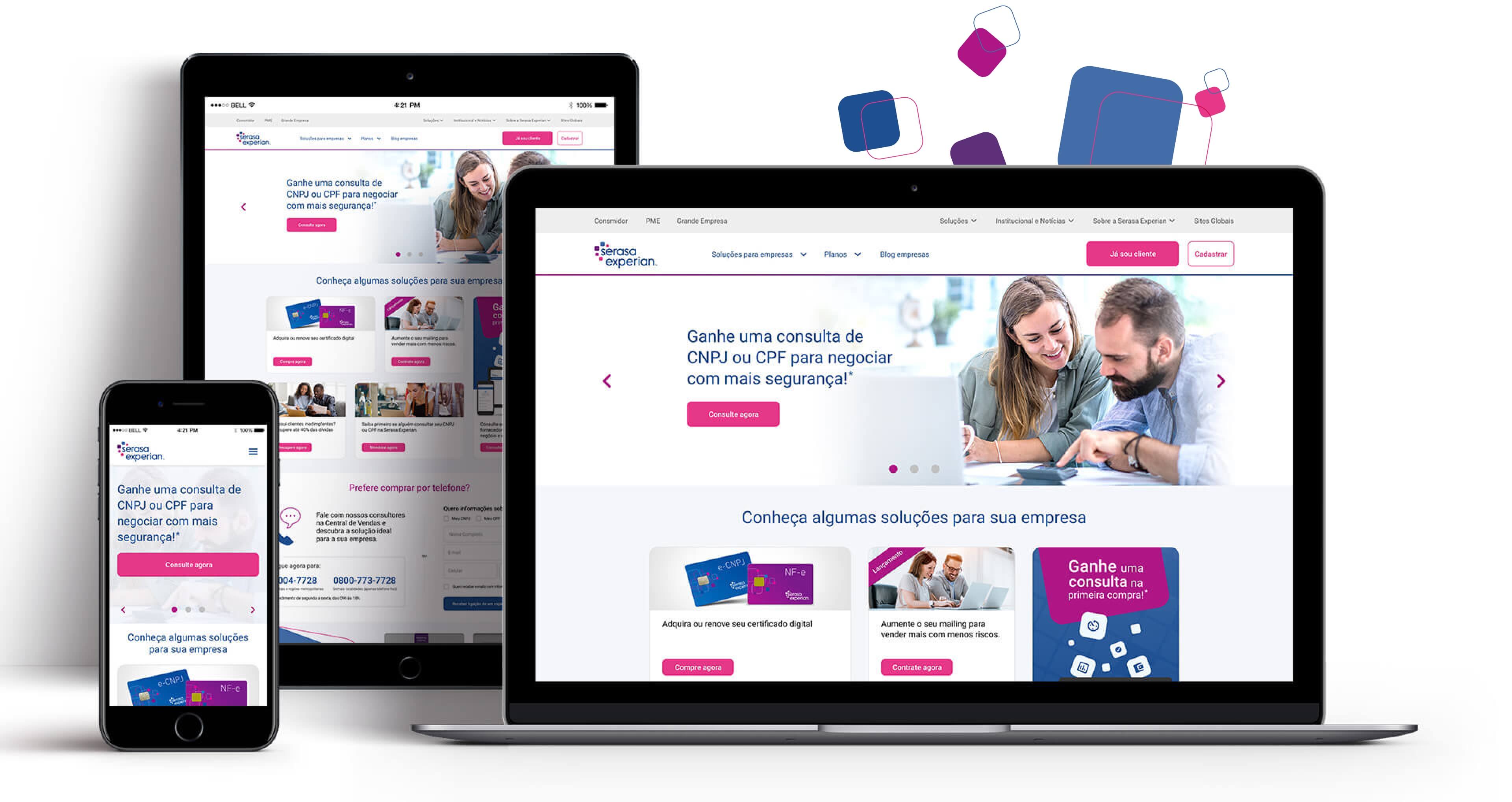
After validated the main journey and user interactions, I refined the UI design for all website
and prepared the screens to handoff for the developers. One important info is that in Serasa Experian
we had a design system and it facilitated so much the process for design and development.

